Trello Brand Refresh
Since 2011, Trello shattered SaaS industry standards by creating a free, easy to understand, and delightful consumer brand. How could we maintain its brand spirit while evolving to expand monetization as a b2b platform?
Scope + Context
Unlike an industry typical “rebrand,” Trello’s brand refresh initiated nearly 3 years after Atlassian’s acquisition. Until this point in time, we were operating in a “do-no-harm” initiative, and most customers were not even aware that the product had even been acquired. As such, the primary objective of the refresh was to bridge the gap between the beloved Trello brand, and Atlassian’s design system.
The outcome was a consolidation of two distinct visual identities, and finding Trello’s voice within the Atlassian system that resulted in a nearly 3 year gradual evolution and consolidation of the brands.
—
Art Direction: Derick Carss, Cindy Duong
Design Lead: Cindy Duong
Supporting Designers: Angy Che, Daniel Walsh, Tracy Chou, Sarah Sauerzopf, Vania Wat, Sari Jack
-
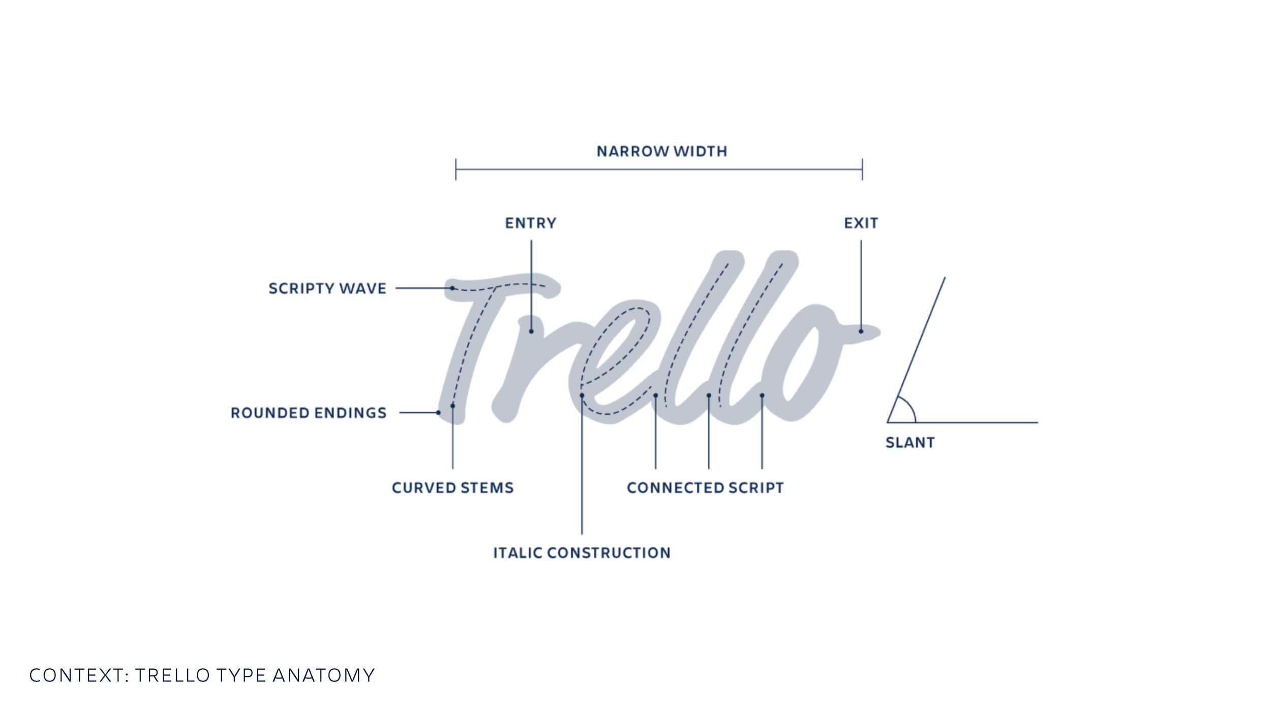
Over 120 logo iterations were considered to maintain the essence of the previous logo while consolidating with the very structured Atlassian product logo library. The process was informative, but the final iteration came unexpectedly.
-
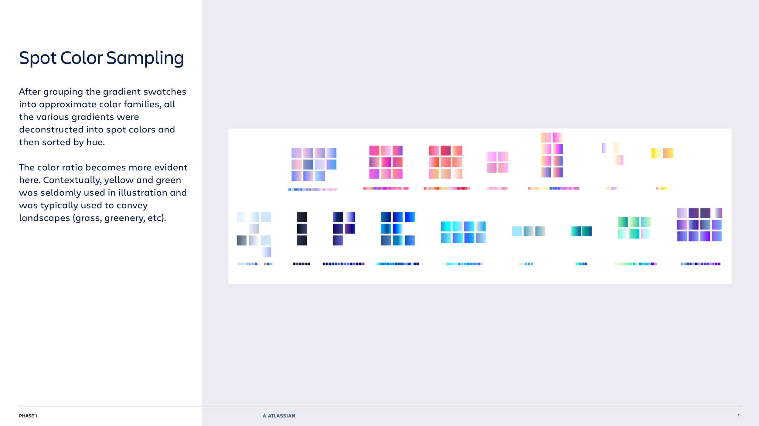
What became the Trello marketing palette was not actually using their design system color palette, it was simply a byproduct of their illustration style. Not only did we have to establish a new color palette, but it had to consider the colors that Atlassian already had. Our solution had eventually evolved the parent brand to expand its color system (and added a new color!).
-
Easily the most complicated and slowest to execute aspect of this project was Illustration. The Atlassian system was highly regarded and its “meeples” took the design industry by storm. However, Trello’s illustrations were well loved amongst its users for being wonderous, expressive, and human. For scalability we needed to adapt Atlassian’s illustration methodology but make it our own. Our solution eventually became part of the house style.
-
Trello’s in-product illustration system was simply a mess. We had illustrations that product designers made in a style from the 2011 brand, marketing/blog illustrations commandeered in a 2016 style, and Atlassian’s modern robust illlustration library to consolidate.
-
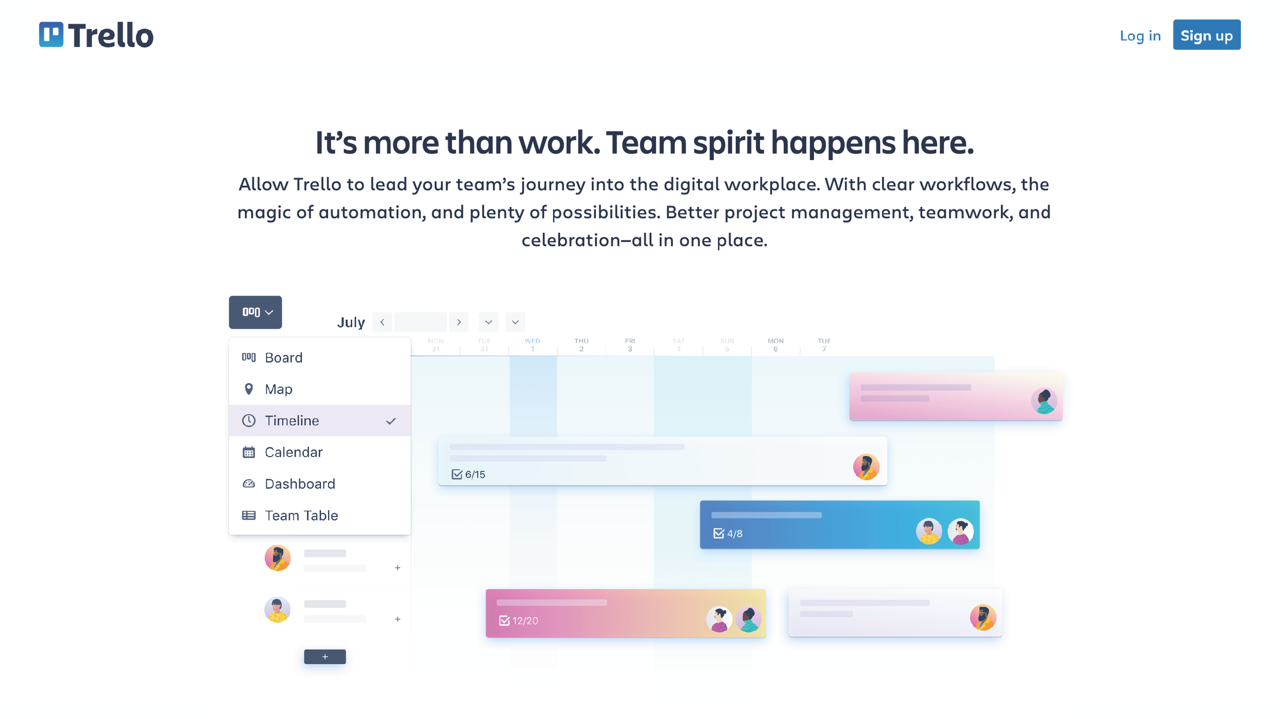
Trello.com before the refresh did not have a component library, majority of its marketing pages were hard-coded and bespoke. Post-acquisition we were tasked to migrate the site onto a new CMS, which meant leaving almost everything behind and starting to build a system from scratch.
-
The basis to ever successful brand is a clear understanding of its core essence. Most express this as mission, vision, and values. For us, the brand’s essence was team spirit and how all things had to ladder up to improving the way that teams experience collaboration.
Storyboard: Daniel Walsh
Animation: Melli Lawrence, George Harbeson


